User Research

This is a usability project focusing on Sephora's website, including:
-
Heuristic Analysis
-
User Persona
-
Usability Test Design and Findings
-
User Interface Improvements
Heuristic Analysis
1 2 3 4
Situational Awareness
Navigation titles and its associated pages correlate
Pages begin with a title or header that describes screen contents
Clear indication is given to the user at all times regarding their location within the site
Cues are present to guide users through their workflow
If multiple steps are required of the user, they are kept informed of where they are in the process
Interface action consequences are clear (buttons, menus, links, downloads, redirection, etc)
4
1
2
3
3
1
Overall score: 2.3
Support Mental Models
Appropriate user experience metaphor has been used
Menu choices are ordered in the most likely way to be logical and coherent to the user
Application aesthetics are appropriate and in context for the user
Tasks are described in terms familiar to the user
Interactions are consistent & expected with targeted users
3
2
1
2
2
Overall score: 2.0
Support User Goals
The navigation scheme and layout actively supports the user's goals
Interactions support user's goals - there are no unnecessary or missing steps
Adequate explanation is given for tasks that require it
All information a user needs is available at each stage of a given workflow
There is a clear hierarchy in the primary calls to action
1
3
1
2
1
Overall score: 1.6
Summary of Heuristic Problems

Menu Choices Not Aligned with User Needs
-
Overlapping menu choices in the navigation bar
-
The 'Makeup' menu starts with less relevant categories such as Just Arrived, Bestsellers, Values & Gifts, instead of products categories such as Face, Eye, Lips.

Lack of Emphasis on Importance
-
A primary task for users on this website - “SHOP” has only one column, while side information such as Community and In-Store Events compete with each other for attention, distracting the user’s eyes.

Inappropriate Use of Expressions
-
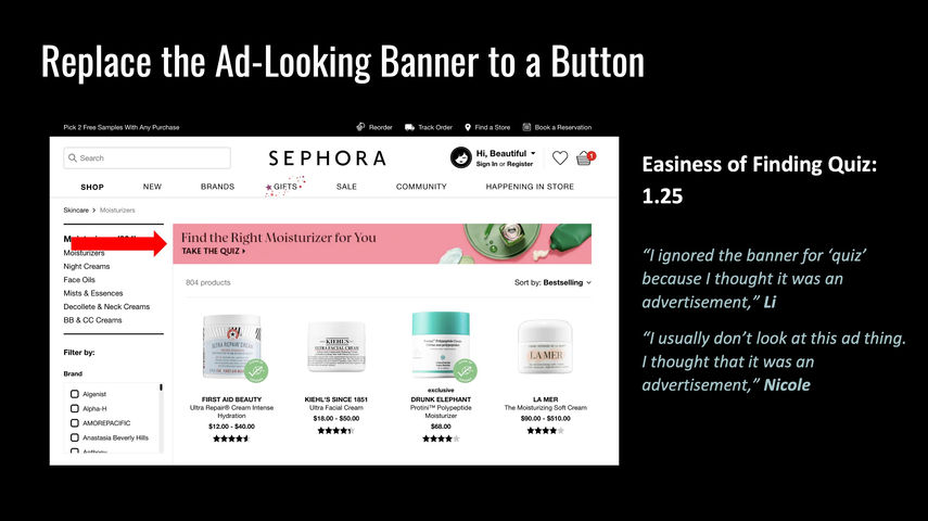
The wording “Quiz” seems to be a test instead of a recommendation.
User Persona
-
Full-time college student majoring in engineering.
-
Have limited time in shopping, daily skincare and make-up.
-
Cannot afford high price.
-
Lives in suburb area, far away from a Sephora physical shop, thus don’t have the time to pay a visit.
-
Plays on two intramural sports teams, spending a lot of time outdoors. Therefore, in need of outdoor skincare product.
-
Have experience in online shopping and basic knowledge on cosmetics.
User Persona
USEr
GOAL
-
Find the right skincare product for herself, considering all her skin features (moisturizing, sun-protection etc.).
-
Find a similar product comparing with the foundation she’s already using but perhaps can work better.
PAIN
POINT
-
Anxiety in choosing the category that fits the best
-
Time consuming in finding what the user wants
-
Confusion in terminology such as “SHOP” and “Quiz”
-
Difficulty in finding quiz and other useful tools
-
Results of quizzes are not helpful
Usability Testing
goals
-
Verify the heuristic problems we encountered including:
-
Navigation is inconsistent, contains too much text, not easy to use
-
Quizzes are hard to find and results are unhelpful
-
Aesthetics are inconsistent and distracting
-
-
Identify other unfound heuristic problems
-
Compare behaviors between users under 20 and users above 30
task 1
You are looking for a skincare product for dry skin that would also work with activities outdoors. Show me how Sephora can help provide guidance on products that suit your skin features.
features tested
-
Navigation: moisturizer
-
“Quiz” findability
-
“Quiz” effectiveness
-
Filters
task 2
Tell me about the features that you look for in a foundation for yourself. Show me where you can find you that or a similar foundation. Find something similar but can perhaps work better.
-
Navigation: foundation
-
“Similar Products” findability
-
“Similar Products” effectiveness
-
Filters
Participants
10
females
5
in 20s
over 30
5
Survey questions
-
On scale 1-5, how easy would you rate your experience with the site today?
-
On scale 1-5, how easy was it to find the quiz on the site?
-
On scale 1-5, how helpful was the quiz?
-
On scale 1-5, how easy was it to find a similar product?
-
On scale 1-5, how likely would you shop on Sephora website later on your own?
-
On scale 1-5, how likely would you recommend Sephora to your family/friends?
Test Findings
Average User Rating: 2.79
Easiness of Finding Quiz: 1.25
Helpfulness of Quiz: 2.75
Easiness of Finding Similar Foundation: 4
Overall User Experience: 3.25
Likelihood to Use Later: 2.75
Likelihood to Recommend: 2.75
Age Difference

Duration v.s. Likelihood to use later

UI Improvements
This project is conducted with classmates, taught by Jason Levine at University of Washington.


