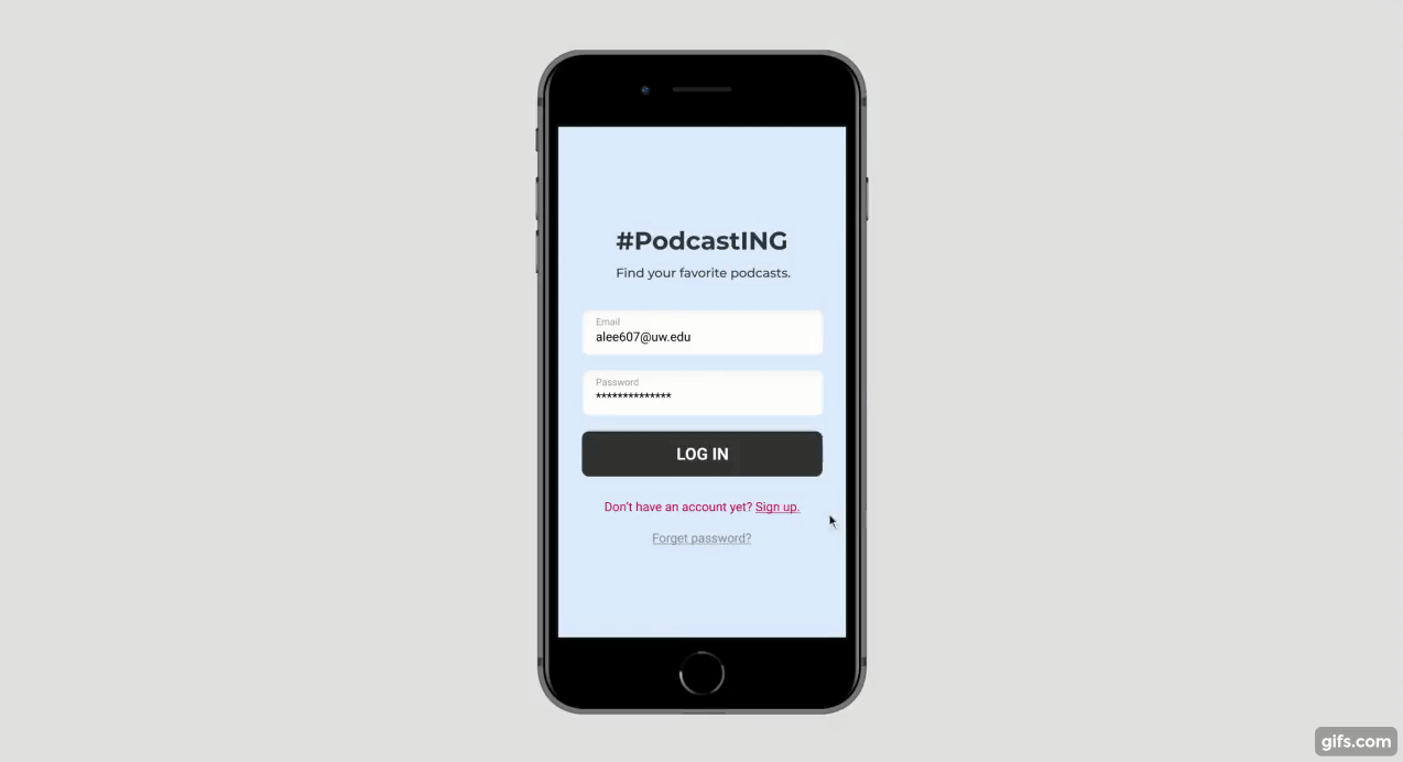
UX Design: #PodcastING

This is a UX design project case study, content and tools including:
-
What’s the Problem? User interviews & User journey map
-
What do existing solutions look like? Competitive teardown
-
What’s my solution? Sketches & Wireframes
-
How I test my prototype: Usability tests
-
The Result
What’s the Problem?
I just started listening to podcasts a couple of months ago. A friend recommended a show, and I spent 2 months only listening to that one show. Why didn’t I look for other shows? While I did do some browsing, I couldn’t tell whether I like the show until I take 10~20 minutes actually listening to an episode. And most of the time, I didn’t like them. Eventually, I gave up.
It’s a pain to find new podcasts that I enjoy.
To see if my hypothesis is valid and to uncover more about podcast listeners and their behaviors, I started with some user interviews. Here are some key questions:
-
How did you learn about the podcast shows that you’re listening to? Where did you find them?
-
What do you do before trying out a new show? How do you pick?
-
What challenges do you face when searching for a new podcast show?
I interviewed 5 podcast listeners: J, F, Y, S, and M. In terms of listening behavior, they can generally be divided into three groups:
Heavy-listeners
J, who commutes to work every day, and F, who commutes to class every day, listen to more podcasts than others. Since they spend a lot of time, they don’t want their time to be wasted. They follow shows they really enjoy, and they are sometimes frustrated about not being able to find what they want.
Light-listeners
Y and S, on the contrary, don’t spend too much time on podcasts because Y goes to school by scooter — not safe to listen to podcasts at the same time — and S’s daily commute time is only about 10 minutes. They are generally satisfied with the shows they follow right now, and don’t have a strong need to find new shows.
Home-listeners
M, as the only interviewee who stays at home for most of the time, sees podcasts as sort of a background company. She is interested in diverse topics, but she doesn’t have an urgent need to learn or keep up with trends.
What’s worth noting is that most people listen to more than one type of podcasts at a time. While they are loyal listeners of their favorite shows, they also like to “switch flavors”.
My original hypothesis is that it’s challenging to find the right podcasts for you. This is most true for J and F, the heavy-listeners. When looking for new shows, what they usually do is to go to the top charts or ask friends for recommendations. Many mentioned that the current categorization is too general.
I believe there is an opportunity for a tool to help, mostly for heavy-listeners but also for other audiences who like to try new flavors.

To examine the podcast-searching process more closely, I used a journey map to reveal the key frustration points mainly for heavy-listeners.
Pain points identified:
-
Browsing through podcast apps can be overwhelming and confusing.
-
Trying out new shows can make people impatient and annoyed.
The goals:
-
Find a new podcast that I am interested in.
-
Find the podcast that’s perfect for me at the moment.
What do existing solutions look like?

Homepage
Job of the page: Recommend podcasts and urge users to start listening.
Homepage mostly includes subscribed or recently played shows, and recommendations based on past listens. Spotify uses a minimal design that encourages users to scroll and browse. Castbox introduces more details and also multiple ways to browse through content such as categories, audiobooks and networks.

Browse (charts/categories)
Job of the page: Help users find podcasts by popularity or category.
Apple Podcast uses shows/episodes tabs and the categories drop-down menu on the top-right corner, which is an easy and clean way to integrate different charts on one single screen. Castbox has secondary categories such as careers and investing. According to my user interviews, primary categories are too broad, which proves secondary tags helpful.

Podcast page
Job of the page: Provide more details of the show and encourage users to listen or subscribe.
Apple Podcast‘s UI looks like App Store’s App page, which users are familiar with. It has sufficient information, including description, ratings, number of ratings, genre, active years. Castbox has a variety of information and functions, including number of subscribers and plays, a dropdown to view a certain season, comments, and sort by newest or oldest. Using tabs to separate different functions makes each tab shorter and simpler.
Finally, some elements that I might emulate…
-
Spotify: Image-centered, horizontal scroll
-
Apple Podcasts: Charts design, showing genre on Podcast page
-
Castbox: Secondary tags, comments on either episodes or shows, number of subscribers
What’s my solution?
The user goal that I’m focusing on:
“Find a new podcast that I am interested in.”
I intend to offer more personalized ways to browse through podcasts. What I found through my user interviews include:
-
Categories are not helpful enough
-
People get podcast recommendations from friends
These two issues led me to two major ideas:
-
Use personalized hashtags to find your favorite topics
-
Enable social sharing on the app
And these ideas led me to the name of the app.
#PodcastING
# referring to the hashtag categorizations and ING referring to real-time social sharing.
When users want to find new podcasts, they can choose to browse by charts or categories, or they can also browse by their favorite hashtags or scroll through their social feed.
I then sketched out what those functions might look like on screen. I played around with different layout and elements using Crazy Eight. After having several design reviews with my peers, I narrowed down my different sketches and made 2 versions of wireframes.

Version 1 focuses on the hashtags. The design is more image-centered. You can see what your friends are playing but not their comments.
Version 2 divides the discover page into 2 tabs. The social feed looks more like social media but without like and comment. (Reason: heavy-listeners usually listen to podcasts on the go and it’s hard to interact too much on the go or when listening to a podcast.)
After another design critique session, I found support for elements on both versions and decided to integrate the best of both worlds. I made a clickable prototype and then move on to usability testing.
How I test my prototype
To find out if the app helps reach the user goal “find a new podcast that I am interested in”, I focused on how user can find a new podcast, through both the discover and the social page. Thus, I designed 2 tasks for my participants:
1. You are taking a train to visit your friend and the ride is roughly 30 minutes. You want to find a new podcast to listen during the trip. You’re interested in career interviews and startups. Now pick something to listen.
2. Suppose that most of your friends are using this podcast app. You’ve listened to all new episodes from your subscribed shows. Now you want to see what your friends are listening to and pick something that’s popular among your friends.
I then recruited 3 participants and observed their behaviors. Overall, participants understand the app and had no significant issues completing the tasks. The discover tab was straightforward and helpful for them. The social tab took more time because they weren’t as familiar with the function.
I discovered needs for some tweaks of the interface. I needed to adjust the homepage (to make it more self-explanatory and engaging), the subcategories (to enable viewing a full list of shows under each subcategory), and the “add post” CTA on the social page.
Participants also brought up a few other interesting suggestions that will need further research and validation, such as a global setting icon, profile bio, option to pin a show on homepage.
Based on their feedback, I made several UI revisions and came up with a final prototype.
The Result
Homepage & Hashtags
The Home page includes Where you left off, New episodes from subscribed shows, and recommended episodes under the hashtags you follow.
You can click on each hashtag to see a full list of related episodes. You can add, delete and adjust the order of hashtags by clicking the edit icon.
Discover: Charts & Categories
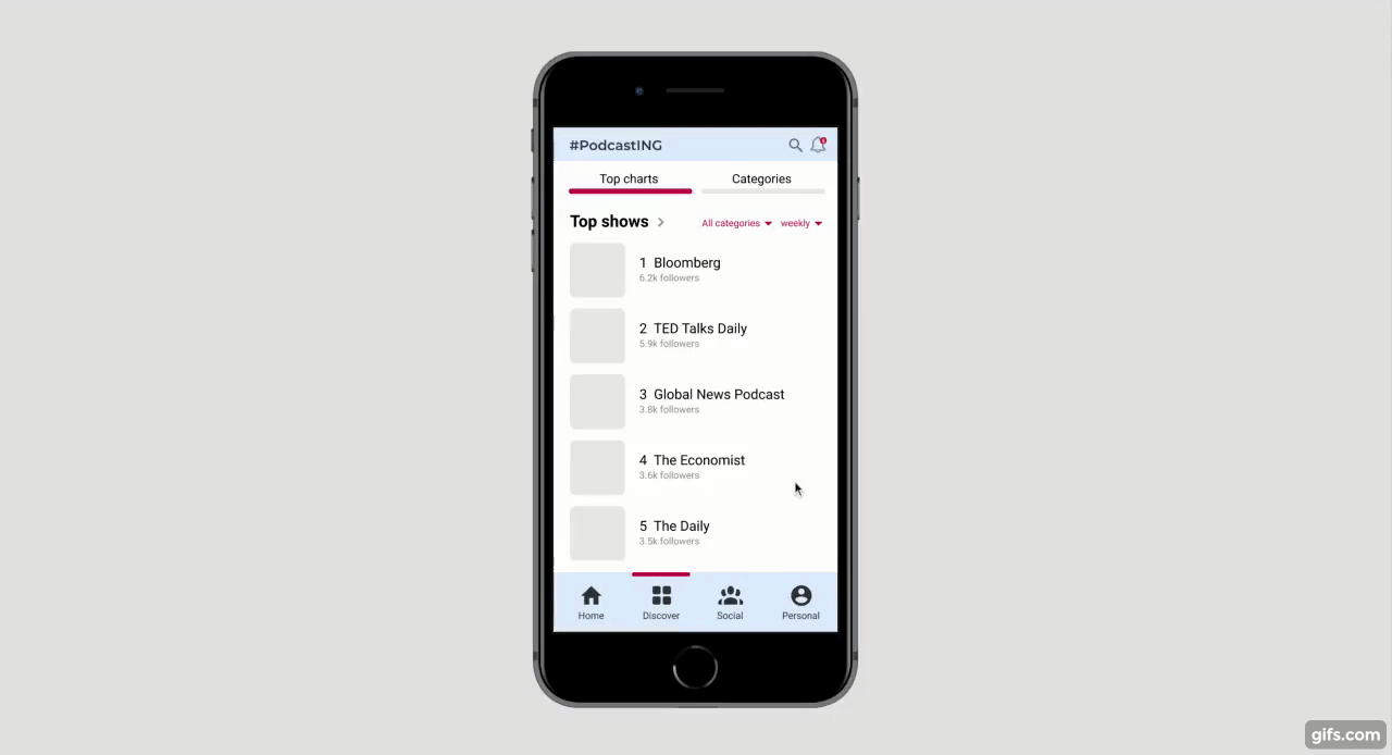
The Discover page includes 2 tabs: Top charts and Categories. For Top shows and Top episodes, there are drop-down menus for users to see charts for different categories during different time intervals.
On the Categories tab, there’s a simple list of primary categories. When you click into a category, there are expandable secondary categories which are also suggested hashtags you can follow. You can expand multiple categories and view the shows on a single screen.
Social page
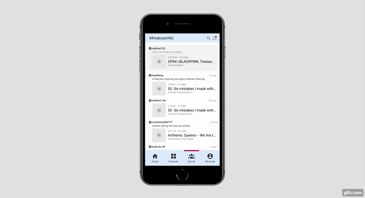
The Social page is a simplified podcast version of Facebook. The top box shows the episode that the user is currently listening, encouraging them to share. Comments and hashtags are optional but encouraged.
Beside scrolling through the feed, users can also click on a friend’s id to view their profile, which includes their public playlists, subscribed shows and past feed.
To wrap up...
Let’s review my findings from the user interviews:
-
It’s challenging to find the right podcasts.
-
Categories are not helpful enough.
-
People get podcast recommendations from friends.
#PodcastING uses hashtags to offer a more personalized way to find the podcast topics that users are interested in. For example, you can follow #pizza and find episodes about pizza from all types of shows — a task that is impossible for existing app’s categorization. The social function let users follow their friends to find inspirations or recommendations.
All in all, #PodcastING finds your favorite podcasts.